Thank you for reading this post, don't forget to Join Our Telegram Group! CLICK HERE TO JOIN NEW
Which Chart is Best for Option Trading:
In Option Trading, having access to accurate and reliable data is crucial for making informed decisions. One powerful tool that traders utilize is charts.
Charts provide visual representations of price movements, patterns, and trends, enabling traders to analyze market behavior and identify potential opportunities.
However, with various chart types available, it can be challenging to determine which chart is best suited for option trading. In this article, we will explore different chart types and their applicability in option trading.
Candlestick Charts For Option Trading:
Candlestick charts are widely used in option trading due to their ability to convey detailed information about price movements.
These charts display the opening, closing, high, and low prices for a given time period through candlestick shapes.
Traders can identify patterns and formations such as doji, engulfing, and harami, which help determine market sentiment and potential reversals.
Candlestick charts are particularly effective in identifying short-term trading opportunities.
Line Charts For Option Trading:
Line charts are simple and straightforward, making them suitable for beginners and those seeking a broader overview of price trends.
These charts plot only the closing prices over a specified time period, connecting the data points with lines.
While line charts lack the detailed information found in candlestick charts, they are useful for identifying long-term trends and support/resistance levels.
Bar Charts For Option Trading:
Bar charts provide comprehensive information about price movements, including opening, closing, high, and low prices.
Each bar represents a specific time period, displaying vertical lines and horizontal dashes to indicate price ranges.
Traders can analyze price volatility, spot trend reversals, and identify key levels of support and resistance.
Bar charts are versatile and suitable for various trading styles.
Renko Charts For Option Trading:
Renko charts focus on price movements rather than time intervals.
These charts use bricks to represent price changes, with each brick having a predetermined value.
Renko charts filter out noise and emphasize trend identification.
They are especially useful in capturing long-term trends and reducing market noise interference.
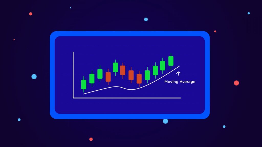
Moving Average Charts For Option Trading:
Moving average charts are constructed by calculating the average price over a specific period and plotting it on the chart.
These charts smooth out price fluctuations, making it easier to identify the overall trend.
Moving averages serve as dynamic support and resistance levels and provide valuable insights into trend reversals and entry/exit points.
Traders can choose from various types of moving averages, such as simple moving averages (SMA) and exponential moving averages (EMA), based on their trading preferences.
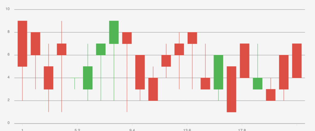
Candlestick Charts:

Explanation of Candlestick Chart Components
Candlestick charts are a popular and powerful tool used in option trading due to their ability to provide detailed insights into price movements.
Understanding the components of candlestick charts is crucial for effectively interpreting the information they present.
Body:
The rectangular-shaped body represents the price range between the opening and closing prices during a specific time period.
A filled or colored body typically indicates a bearish trend, where the closing price is lower than the opening price.
Conversely, an empty or hollow body suggests a bullish trend, with the closing price higher than the opening price.
Wick or Shadow:
The thin lines, known as the wick or shadow, extend from the top and bottom of the body.
They represent the price range between the high and low prices during the same time period.
The upper shadow indicates the highest price reached, while the lower shadow represents the lowest price.
Benefits of Using Candlestick Charts in Option Trading
Utilizing candlestick charts in option trading offers several advantages, enabling traders to make well-informed decisions and identify potential trading opportunities.
1. Visualization of Price Patterns:
Candlestick charts provide a visual representation of price patterns, making it easier to identify trends, reversals, and market sentiment.
Traders can quickly analyze the relationship between opening, closing, high, and low prices within a specific time frame.
2. Enhanced Timing:
Candlestick charts offer insights into market timing. By observing the length and color of the candlestick bodies, traders can gauge the strength and duration of price movements.
This information is valuable for determining optimal entry and exit points for option trades.
3. Widely Recognized Patterns:
Candlestick charts have well-established patterns that traders often rely on for identifying potential trading opportunities.
Patterns such as doji, engulfing, and harami can indicate trend reversals, continuation, or consolidation, helping traders anticipate future price movements.
Common Candlestick Patterns for Identifying Potential Option Trading Opportunities
1. Doji: A doji occurs when the opening and closing prices are nearly equal, resulting in a small or nonexistent body.
This pattern suggests indecision in the market and can indicate a potential trend reversal.
2. Engulfing: An engulfing pattern occurs when a larger candlestick completely engulfs the previous smaller candlestick.
Bullish engulfing patterns suggest a reversal from a bearish trend, while bearish engulfing patterns indicate a reversal from a bullish trend.
3. Harami: The harami pattern consists of a small candlestick (the “baby”) inside the previous larger candlestick (the “mother”).
This pattern suggests a potential trend reversal, with the baby candlestick representing market indecision.
By recognizing and understanding these common candlestick patterns, option traders can enhance their ability to identify potential trading opportunities and make informed decisions based on the prevailing market conditions.
Incorporating candlestick charts into option trading strategies provides traders with valuable insights into price movements, trends, and potential reversals.
By analyzing the components of candlestick charts and recognizing common patterns, traders can gain a competitive edge in the dynamic world of options trading.
Line Charts:
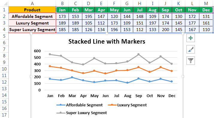
Overview of Line Charts and Their Simplicity
Line charts are one of the simplest and most commonly used chart types in option trading.
They provide a straightforward representation of price movements over time by connecting the closing prices of an asset with a continuous line.
Line charts offer a clear visualization of the overall trend and are particularly useful for gaining a broad overview of price behavior.
How Line Charts Can Help in Identifying Trend Directions in Option Trading
Line charts are effective in identifying trend directions and understanding the general market sentiment.
By observing the slope and direction of the line, traders can determine whether an asset’s price is in an uptrend, downtrend, or consolidating.
This information is crucial for making informed trading decisions, such as entering positions aligned with the prevailing trend or identifying potential trend reversals.
Line charts are especially valuable for long-term trend analysis, as they smooth out short-term price fluctuations and provide a clearer picture of the asset’s overall trajectory.
Traders can easily identify higher highs and higher lows in an uptrend, lower highs and lower lows in a downtrend, or a range-bound market characterized by horizontal price movements.
Limitations of Line Charts for Option Trading and When to Use Them
While line charts offer simplicity and a quick snapshot of trend direction, they have certain limitations that traders should be aware of.
Lack of Detailed Information:
Line charts only display the closing prices, omitting important data such as opening, high, and low prices.
As a result, they may not capture the full range of price fluctuations and potential market volatility.
For comprehensive analysis and precise entry/exit points, traders may need to rely on other chart types that provide more detailed information.
Limited Timing Analysis:
Line charts do not provide information about the timing of price movements within a given time period.
Traders may miss out on important intra-day or intra-week price dynamics, making it challenging to identify short-term trading opportunities or time their trades more precisely.
Not Suitable for Scalping or Day Trading:
Due to their focus on longer-term trends, line charts are less suitable for scalping or day trading strategies that require capturing quick price movements within short time frames.
Traders engaging in such strategies may find other chart types, like candlestick charts or bar charts, more appropriate for their needs.
Despite these limitations, line charts can still be valuable in certain situations.
They are useful for gaining a broad understanding of an asset’s trend direction, particularly for long-term investors or swing traders who prioritize capturing major price moves rather than short-term fluctuations.
Line charts also serve as a foundation for more advanced technical analysis methods when used in combination with other chart types or indicators.
line charts offer simplicity and a clear depiction of trend directions in option trading.
While they may lack detailed information and precise timing analysis, they provide a useful starting point for understanding the overall market sentiment.
Traders can utilize line charts in conjunction with other chart types to gain a more comprehensive view of price behavior and make well-informed trading decisions based on their specific trading style and objectives.
Bar Charts:
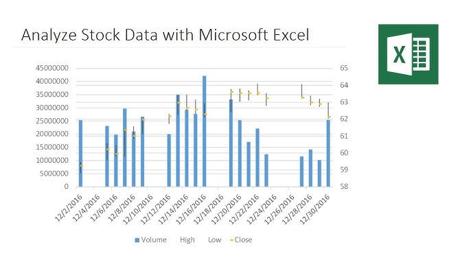
Explanation of Bar Chart Components
Bar charts are a popular charting method used in option trading to visualize price data and analyze market behavior.
Understanding the components of bar charts is crucial for effectively interpreting the information they convey.
Bars: Each bar on a bar chart represents a specific time period, such as a day, week, or month.
The bar consists of four key components: the opening price, the closing price, the high price, and the low price.
The vertical line represents the price range between the high and low prices, while the horizontal lines extending from the left and right sides of the bar indicate the opening and closing prices, respectively.
Advantages of Using Bar Charts for Option Trading
Bar charts offer several advantages that make them valuable tools for option traders, providing insights into price volatility and support/resistance levels.
Comprehensive Price Information:
Bar charts provide a comprehensive view of price movements by including the opening, closing, high, and low prices for a specific time period.
This detailed information enables traders to analyze market dynamics and identify potential trading opportunities.
Visualizing Price Volatility:
The length of the vertical line on a bar chart reflects the price range between the high and low prices.
Longer vertical lines indicate higher price volatility, while shorter lines suggest lower volatility.
Traders can use this information to assess market conditions and adjust their trading strategies accordingly.
Support and Resistance Levels:
Bar charts assist in identifying key support and resistance levels. Support levels are price levels at which buying pressure tends to outweigh selling pressure, resulting in potential price reversals.
Resistance levels, on the other hand, are price levels at which selling pressure tends to outweigh buying pressure.
Traders can monitor these levels on bar charts to determine optimal entry and exit points for their option trades.
Using Bar Charts to Analyze Price Volatility and Support/Resistance Levels in Option Trading
Analyzing Price Volatility: By observing the length and frequency of the vertical lines on a bar chart, traders can gauge the level of price volatility in the market.
A series of longer bars indicates increased volatility, which may present both opportunities and risks for option traders.
Conversely, a series of shorter bars suggests reduced volatility, signaling a more stable market environment.
Identifying Support and Resistance Levels: Bar charts help traders identify key support and resistance levels, which are crucial for making trading decisions.
Support levels are typically located below the current market price, while resistance levels are situated above.
Traders can look for areas on the chart where prices have repeatedly bounced off or struggled to break through to identify these levels.
Utilizing these support and resistance levels can aid in setting profit targets, determining stop-loss levels, and assessing potential trade risk.
By utilizing bar charts, option traders can gain a comprehensive understanding of price movements, assess price volatility, and identify crucial support and resistance levels.
These insights can inform their trading decisions and contribute to the development of effective option trading strategies.
Remember, while bar charts provide valuable information, they should be used in conjunction with other analysis tools and indicators to enhance trading accuracy and reliability.
Renko Charts:
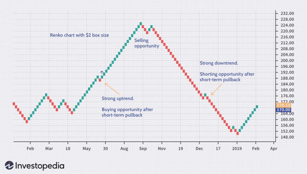
Introduction to Renko Charts and Their Unique Characteristics
Renko charts are a lesser-known but powerful charting method used in option trading.
Unlike traditional charts that are time-based, Renko charts focus solely on price movements, filtering out noise and providing a unique perspective on market behavior.
Renko charts consist of bricks or blocks that are either filled or hollow, representing price changes.
The size of each brick is predetermined, and new bricks are only drawn when a specific price movement, determined by the brick size, occurs.
As a result, time is not a factor in Renko charts, and only significant price movements are reflected.
Benefits of Renko Charts in Option Trading, Especially for Trend Identification
Renko charts offer several advantages for option traders, particularly in identifying and analyzing trends:
Trend Identification: Renko charts excel at identifying trends by filtering out minor price fluctuations and focusing on significant price movements.
Traders can easily spot the direction of the trend based on the pattern of filled or hollow bricks. This clarity is particularly beneficial for swing traders and trend-following strategies.
Reduced Noise and Market Volatility: Renko charts eliminate noise caused by minor price fluctuations, resulting in smoother and cleaner price patterns.
This reduction in noise helps traders identify the underlying trend more clearly and reduces the impact of market volatility on decision-making.
Clear Entry and Exit Signals: Renko charts provide clear entry and exit signals based on the formation and continuation of bricks.
When a new brick is formed in the same direction as the existing trend, it confirms the strength of the trend.
Conversely, a brick formed in the opposite direction can signal a potential trend reversal, prompting traders to consider their exit strategies.
Considerations When Using Renko Charts and Their Limitations
While Renko charts offer unique advantages, traders should be mindful of the following considerations and limitations:
Brick Size Selection: The brick size in Renko charts plays a crucial role in determining the sensitivity of the chart.
Choosing an appropriate brick size is essential to capture the desired level of price movements and avoid oversensitivity or insufficient sensitivity.
Traders should consider the volatility and characteristics of the asset they are trading to determine the optimal brick size.
Delayed Entry and Exit Signals: Since Renko charts rely on significant price movements to form bricks, there may be a delay in generating entry and exit signals compared to other chart types.
Traders should be aware of this delay and consider using additional indicators or chart types to complement Renko charts for more timely trade execution.
Lack of Time Information: Renko charts do not provide any time-related information, making it challenging to analyze intra-day or intraweek price dynamics.
Traders who rely heavily on timing and short-term price movements may find it necessary to incorporate other chart types alongside Renko charts.
In conclusion, Renko charts offer a unique perspective on price movements and are particularly useful for trend identification in option trading.
Their ability to reduce noise and focus on significant price movements enhances the clarity of trends and provides clear entry and exit signals.
However, traders should carefully consider brick size selection, be mindful of potential delays in signals, and supplement Renko charts with other chart types when necessary.
By understanding these considerations, traders can effectively utilize Renko charts as part of their option trading strategies.
Moving Average Charts:
Overview of Moving Averages and Their Significance in Option Trading
Moving averages are widely used in option trading as powerful tools for trend analysis and identifying potential entry and exit points.
A moving average is a calculation that averages out the prices of an asset over a specific period, creating a line that smooths out price fluctuations and reveals the underlying trend.
Moving averages are significant in option trading for several reasons:
Trend Identification:
Moving averages help traders identify the direction of the prevailing trend.
By plotting a moving average on a chart, traders can quickly assess whether the price is in an uptrend, downtrend, or trading within a range.
This information is crucial for aligning trading strategies with the overall market sentiment.
Support and Resistance Levels:
Moving averages act as dynamic support and resistance levels.
During an uptrend, the moving average line often acts as support, providing a potential buying opportunity when the price pulls back to the moving average.
In a downtrend, the moving average line serves as resistance, signaling potential selling opportunities as the price approaches the line.
How to Use Moving Average Charts for Trend Analysis and Entry/Exit Points in Option Trading
Moving average charts are instrumental in analyzing trends and determining optimal entry and exit points for option trades.
Here’s how traders can utilize them effectively:
Trend Analysis:
By comparing the price action with the moving average line, traders can identify the overall trend.
If the price consistently stays above the moving average, it suggests an uptrend, while prices consistently below the moving average indicate a downtrend.
Traders can adjust their trading strategies accordingly, focusing on buying options in an uptrend or selling options in a downtrend.
Moving Average Crossovers:
Moving average crossovers occur when two different moving averages intersect. The most common crossover is the “golden cross” and “death cross.”
A golden cross happens when a shorter-term moving average, such as the 50-day moving average, crosses above a longer-term moving average, like the 200-day moving average.
This indicates a potential bullish trend. Conversely, a death cross occurs when the shorter-term moving average crosses below the longer-term moving average, suggesting a potential bearish trend.
Entry and Exit Points:
Traders can utilize moving averages to determine entry and exit points for option trades. During an uptrend, a pullback to the moving average line can provide a favorable entry point for buying options.
Conversely, in a downtrend, a bounce off the moving average line can signal a potential exit or selling opportunity.
Traders can combine moving averages with other indicators or price patterns to validate their entry and exit decisions further.
Using Different Types of Moving Averages and Their Implications
There are various types of moving averages, and each has its own implications for option trading. The most commonly used types are:
Simple Moving Average (SMA):
The simple moving average calculates the average price over a specific period, giving equal weight to each data point. SMAs are straightforward and provide a smooth line on the chart.
Exponential Moving Average (EMA):
The exponential moving average assigns more weight to recent price data, making it more responsive to recent price changes.
EMAs can help traders capture trend shifts more quickly.
Weighted Moving Average (WMA):
The weighted moving average assigns different weights to each data point, with more weight given to recent prices.
WMAs are useful for traders who want to give more importance to recent price movements while smoothing out the overall trend.
The choice of moving average type depends on a trader’s preference and trading strategy.
SMAs are commonly used for long-term trend analysis, while EMAs are favored by short-term traders seeking quicker signals. WMAs offer a balance between the two.
In conclusion, moving average charts are essential tools in option trading for trend analysis and identifying entry and exit points.
Traders can use moving averages to analyze trends, spot moving average crossovers, and determine optimal trading opportunities.
By understanding the implications of different types of moving averages, traders can choose the most suitable one for their trading style and effectively incorporate them into their option trading strategies.
FAQs
Q: Which Chart is Best for Option Trading
Candlestick charts are considered the best for option trading due to their ability to display price patterns, market sentiment, and potential entry/exit points with clarity.
Q: What is the significance of candlestick charts in option trading?
Candlestick charts provide visual insights into price patterns and market sentiment.
Q: How can line charts help in option trading?
Line charts are simple and effective in identifying trend directions.
Q: What are the advantages of using bar charts for option trading?
Bar charts offer detailed price information, support/resistance levels, and volatility analysis
Q: Why are Renko charts beneficial for option trading?
Renko charts filter out noise and focus on significant price movements, aiding trend identification.
Q: Is there a one-size-fits-all chart for option trading?
No, the best chart type depends on individual trading preferences and strategies.
Conclusion
In this blog post, we explored various chart types commonly used in option trading.
We discussed the unique characteristics and benefits of each chart type, including candlestick charts, line charts, bar charts, Renko charts, and moving average charts.
Bar charts offer detailed price information, support/resistance levels, and volatility analysis
Candlestick charts provide visual insights into price patterns and offer a comprehensive view of market sentiment.
Line charts offer simplicity and clarity in identifying trend directions.
Renko charts filter out noise and focus on significant price movements for trend identification.
Moving average charts help analyze trends and determine entry/exit points.
Importance of Choosing the Right Chart Based on Trading Style and Objectives:
Choosing the right chart type is crucial in option trading as it directly impacts trading decisions and outcomes.
Traders must consider their trading style, objectives, and the specific information they need to make informed choices.
Some traders may prefer visualizing price patterns and candlestick formations, while others may prioritize trend analysis using moving averages.
The key is to align the chart type with individual trading preferences to enhance decision-making.
Encouragement to Experiment with Different Charts to Find What Works Best:
While this article provides an overview of different chart types, it is essential to remember that there is no one-size-fits-all approach.
Each trader has unique preferences and strategies.
Therefore, it is encouraged to experiment with various chart types and combinations to find what works best for individual trading style and objectives.
By trying different charts, traders can gain firsthand experience and develop a deeper understanding of the nuances and advantages of each chart type.
It is through this experimentation that traders can refine their trading strategies and optimize their decision-making process.
Understanding different chart types and their applications is essential for successful option trading. By summarizing the characteristics of each chart type, emphasizing the importance of choosing the right chart based on trading style and objectives,
and encouraging experimentation, traders can enhance their trading skills and improve their overall success in the dynamic world of option trading.
Join My Telegram Channel And Dont Forget To Share